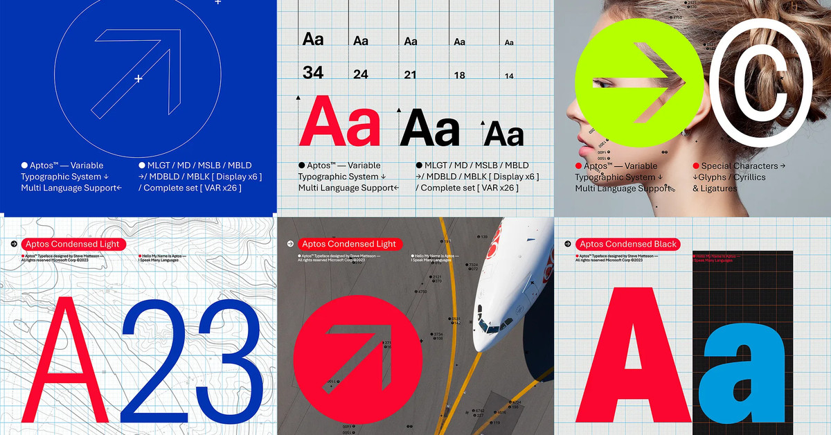
“Today we begin the final phase of this major change where Aptos will start appearing as the new default font across Word, Outlook, PowerPoint and Excel for hundreds of millions of users,” explains Si Daniels, a principal program manager at Microsoft, in a design blog post today. “And, over the next few months it will roll out to be the default for all our customers.”“Today we begin the final phase of this major change where Aptos will start appearing as the new default font across Word, Outlook, PowerPoint and Excel for hundreds of millions of users,” explains Si Daniels, a principal program manager at Microsoft, in a design blog post today. “And, over the next few months it will roll out to be the default for all our customers.”
I’m not sure I understand why they want to replace Calibri, but I guess a fresh typeface every now & then isn’t a bad thing.
What do you all think of this Aptos?
Any ideas why sans serif seems to be taking over the world? I generally find serif fonts easier to read, at least when the medium has the necessary resolution to properly render them.
Anyway, I’ll continue make sure that all my stylesheets are based on Garamond. :)
Sans serif and display fonts in general are designed with subpixel matrices in mind. How well they succeed is another thing entirely. You could easily design a serif font that’s display friendly (see most monospace fonts) but they often invoke different feelings than a display font. That combined with the fact that Microsoft wants to push neumorphism, and font choice is part of that redesign, it makes sense to phase out calibri which was designed to fit with the flat look of metro design