
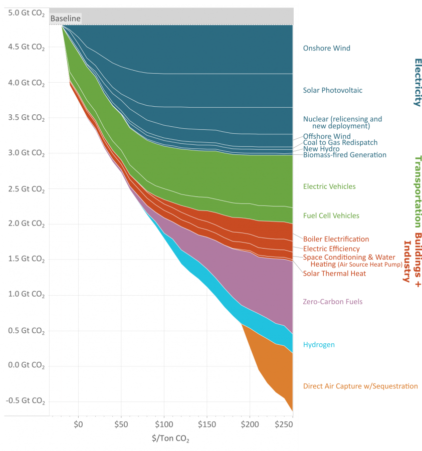
As you reduce the amount of carbon emissions (the y axis) the methods to keep reducing carbon cost more (the x axis.)
This great graph came to my attention from this video from vlogbrothers. It also has some good explanations of what it means.
Note that carbon capture doesn’t really make sense till you’ve exhausted all the other emission minimizing methods.
Source: https://www.edf.org/revamped-cost-curve-reaching-net-zero-emissions
Looked at the graph for 5 minutes and I have no clue what it’s trying to say. Based on the text “cost per 1 metric ton” I would expect a one dimensional chart, not a x/y-axis and definitely not a stacked area chart. Didn’t watch the explanation video though.
You can only reduce so much carbon going to solar or EVs. As you reduce the amount of carbon emissions (the y axis) the methods to keep reducing carbon cost more. (the x axis)