
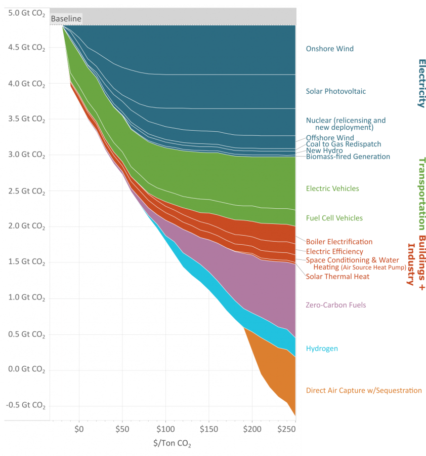
As you reduce the amount of carbon emissions (the y axis) the methods to keep reducing carbon cost more (the x axis.)
This great graph came to my attention from this video from vlogbrothers. It also has some good explanations of what it means.
Note that carbon capture doesn’t really make sense till you’ve exhausted all the other emission minimizing methods.
Source: https://www.edf.org/revamped-cost-curve-reaching-net-zero-emissions
I mean there are two approaches we can take here. One is to go after their methods, and the second is to go after their presentation of the data. What they aren’t clearly stating is that this is a supposed optimization around sequestration capacity, because its implicit to their methods. This has so many assumptions baked into it, it doesn’t even make sense to begin unpacking them. The biggest are assumptions around saturation. Like if carbon was being priced at 150 a Mg, not a soul on the planet is going to be bothering with DAC when you could plop down solar panels in Finland and still make a profit.
But this isn’t ‘method is beautiful’ this is data is beautiful.
All they needed to do to improve the MAC curve was add a cumulative sum curve on a secondary axis. Honestly, just swapping X and Y might be enough to save this… this ‘thing’ they’ve created.