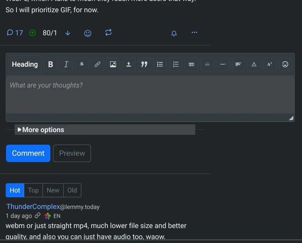
When on a page that has a text box (for example, open any thread), on mobile, the text box is wider than the rest of the page, which makes for weird/poor UX on mobile.
Notice that if I scroll to the bottom of the page, the “Search” and “Settings” links are not even visible. The footer seems to stretch to fit the width of the widest page element.

If I zoom out, I can make everything fit onscreen. But then things look weird.

If you visit any page that does not have a text box (i.e. the front page or any community), the page looks fine. No zooming out or horizontal scrolling necessary.
Playing around with window sizes on desktop, it seems like the textbox dynamically sizes with the window, but only down to a certain width. The textbox width grows when you expand the window and shrinks when you narrow the window, but it only shrinks to a certain width. If you keep making the window more narrow, the text box won’t keep shrinking. Without actually knowing the first thing about this codebase, I assume there is just some minimum width value on the textbox that needs to be lowered.
Fixed.
Can confirm, using Ironfox.