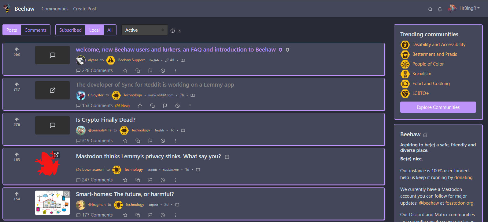

Right you are, apologies, construction bots are a game changer. Logistic bots can be convenient though.


Right you are, apologies, construction bots are a game changer. Logistic bots can be convenient though.


Would love a testflight link once it’s up, I’m on iOS 17 Dev Beta.


Logistic bots are a game changer. For real.


Just wish it had native exchange activesync support, since we’re forced to use exchange accounts at work, and Microsoft no longer allows using M365 accounts directly via IMAP (you need to register applications in Azure that can instead use IMAP)
Stuck using BlueMail instead since it’s the only desktop client that mostly supports EAS. Aside from MailSpring but it had no calendar support despite being promised for years.
Can’t use Outlook since I’m on Linux and running a VM for it is a bit heavy. And I can’t stand outlook web.
Hey so I made a Dracula theme! Let me know if you think I’ve missed anything or it needs any changes.

I love these videos from Josh
Hey check the repo again, made some proper dark versions!
Alright, I’ve added some ‘quieter’ options that look a lot less colorful for those that want something a bit more subtle, both for the light and dark themes. Thank you for the feedback!
Okay that makes sense, will try to create a few more subtle themes, thank you!
No case, no screen protector, only have a single micro scratch, had the phone a year and a half.


I’d also quite like this.


It’s dwarf fortress!
I’m sure that could be arranged! Will take a crack at it once I’ve got a bit of time


I’ve been meaning to upgrade but GPUs are stupid expensive where I live if you want something decent.


Cries in GTX 1060
Unfortunately you can’t; it would need to be implemented by the owner of the instance to make it selectable there, but these themes have been built to work with the default litely theme on any Lemmy instance, all you need is a browser plugin/extension that can inject custom CSS in order to use these themes.


Hey so I setup a repo; swap to the default green litely theme, and then test a few of these out, I think they turned out quite well!
https://github.com/HrBingR/Lemmy_CSS/
Please feel free to submit pull requests if you have other colors or ideas you think would look nice. The more the merrier!


Hey so just a heads up, I made a few more changes that I quite like (again, for the red theme, tweak appropriately for the default green theme), so thought I’d just update you.
This changes the main feed quite a bit, adding a bit more of a card-like design to posts, though I have done my best to make sure there isn’t too much white-space from this change, I just feel it looks a bit more modern, but again, feel free not to use it :)
It also, and this is my favorite change, changes the title color of any post you’ve visited, something that I feel is basic but for some reason Lemmy didn’t have before. So now any posts you’ve visited before will be a light-gray color instead. Hope you find some value here.
.container-lg {
    max-width: 1600px;
}
.col-md-8 {
    max-width: 80%;
    flex: 0 0 80%;
}
.col-md-4 {
    max-width: 20%;
    flex: 0 0 20%;
}
.col-sm-2 {
    max-width: 10%;
    flex: 0 0 10%;
}
.col-sm-9 {
    margin-left: 5px;
    max-width: 80%;
    flex: 0 0 80%;
}
.post-listing {
    border: 1px solid rgba(34,34,34,.125);
    /*border-bottom: 0px;*/
    border-color: #c80000;
    border-radius: 5px;
    margin-bottom: 8px;
    padding-top: 10px;
    background-color: #fff;
    transition: all .2s;
    box-shadow: 2px 2px 1px #c80000;
}

hr {
    display: none;
}
.border-top {
    border-top: 1px solid rgba(34,34,34,.125)!important;
}
.border-light {
    border-color: #e4e4e5!important;
}
body {
    background-color: #ecf0f1;
}
.navbar {
    background-color: #fff;
}
.card {
    background-color: #fff;
    box-shadow: 2px 2px 1px #c80000;
}
.col-12 .card {
    box-shadow: none;
}
.comments {
    padding-left: 10px;
    background-color: #fff;
}
a:visited .d-inline-block {
    color:#d6d7d9!important;
}
.my-2 {
    margin-bottom: 0px!important;
}
According to the GitHub page it’s heavily inspired by Apollo, so that’s got me quite excited.
Don’t think Beehaw has updated to Lemmy 0.18 yet.