
- cross-posted to:
- environnement@jlai.lu
- cross-posted to:
- environnement@jlai.lu
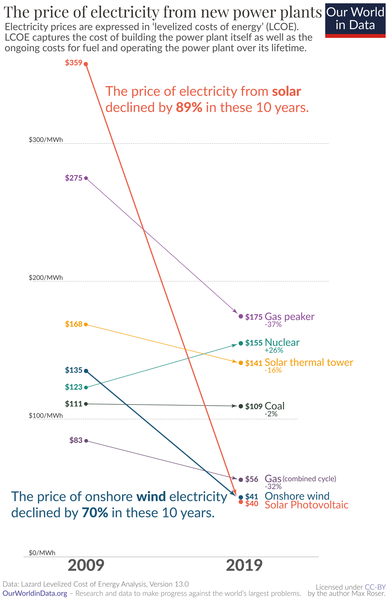
Solar now being the cheapest energy source made its rounds on Lemmy some weeks ago, if I remember correctly. I just found this graphic and felt it was worth sharing independently.
You must log in or register to comment.
Imagine how steep that line would be if the fossil fuel lobbies hadn’t been fighting it tooth and nail all these years
much more important: we’d be years ahead with storage technology.
I could be wrong but I don’t think there’s any evidence that the fossil fuel industry worked to suppress storage research/funding. Pretty much every IT industry has a huge interest in improving battery tech and energy storage in general, it’s just that we’ve already hit all the low hanging fruit from a chemistry standpoint
I remember hearing stories about oil companies buying up battery patents. But this may be because they want to collect the royalties, not necessarily to suppress any kind of research. But like you said, I don’t think there is any evidence… But if they were suppressing the technology, we probably would never know about it.
My dad was a VP at an oil major and has a literal story of an LNG tech being bought and shelved. Yet he’s still just like the people he complains about in that story. They’re a strange generation, these boomers.
It would be less steep because solar costs would have come down earlier.
That would make it steeper, no?
This part of the graph (2009-2019) would be less steep, because this sharp drop would have happened earlier - we’d be further along the curve
Is this just the cost per raw Watt produced?
Is it a fair comparison vs conventional fuel-based power (coal/nuclear)?
Ie: if you wanted to build a plant capable of producing continuously, 24 hours a day, you would need some multiple of solar panels to produce an excess during daylight, and storage.
Not that drastic drops in solar costs aren’t bad, just what would the cost-per-watt be if you had to power an average city on just solar for a year?
Well you’ll never get a “fair” comparison, because the environmental effects are never properly priced into the consumer price.
Look at the subtitle on the chart, it’s levelized cost over the generator’s lifetime. So not including storage for any intermittent source like solar or wind
And not including the financing cost of buying up an this upfront.
I’m buying 36kWh solar array and it will be home made diy, used.parts and maximum jank and don’t paid upfront because that’s the only way it makes economic sense and that’s hoping it works for more than 7 years (break even point at my insolation level and and grid price (8.8$cad/kWh) and it only works with net metering)
Without saying anything about politics, environment, or source:
Why, for the love of Satan, does this graph have only 2 data points per source?
Why use a line chart 📉 for that?
This is clear bar chart territory 📊.
It’s called a slope chart and it has several benefits compared to bar charts:
- https://datavizproject.com/data-type/slope-chart/
- https://seeingdata.org/taketime/inside-the-chart-slope-graph/
- https://www.storytellingwithdata.com/blog/2020/7/27/what-is-a-slopegraph
I for one think this is much better than using a bar chart for this use case, as the angled arrows make it immediately obvious the information that matters the most here (the rate of change) while still keeping it contextualized (by relative positions). The bar chart version of this would inevitably look more cluttered and would not be more effective in conveying the incredible progress in solar costs.
I know it’s not ideal, but a bar chart design could either focus on the difference over time for each source, or the difference between sources at each time. This plot gives a good representation of both the differences between sources and the change in time for each source. It really drives home how far solar prices have fallen relative to other sources and in absolute terms.
The cost of the panels themselves doesn’t seem to have gone down nearly that much.
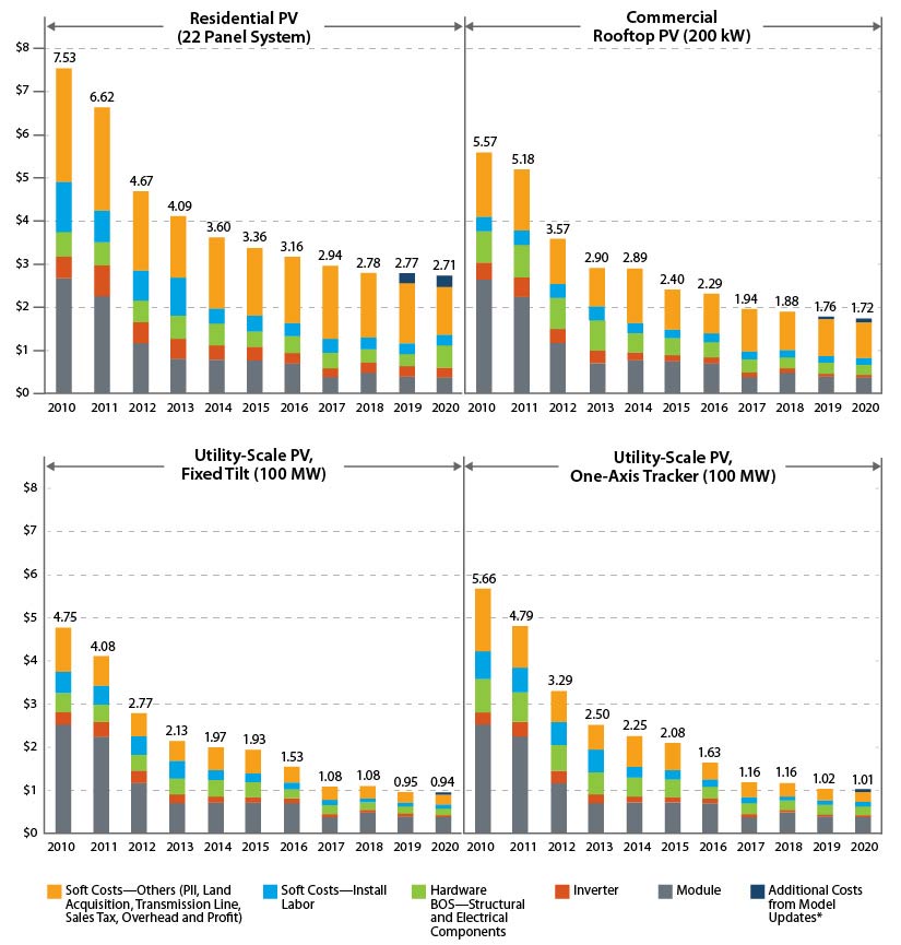
OP’s data is LCOE, which takes into account much more than $/MW. Rather importantly, expected operating liftetime is a major component (and historically THE major economic downside of PV).
IIRC, LCOE is calculated for utility-scale solar, which has seen a 500% decrease according to your chart.
Finally, Neither chart specifies, but if OP’s is in constant dollars and yours isn’t that would explain a lot as well.
Thanks, China.
And Germany!
Dang, it’s almost like it was worth all the research money the government crammed into it in the long run, unlike what my dad said to me a million times.
It doesn’t matter how cheap solar is. Fossil fuels are still more profitable, because once a fossil fuel plant is built, it needs fossil fuel to run. You can’t do the same with sunlight. We literally cannot shift away from fossil fuels under the current profit driven model.
More profitable for fossil fuel companies, sure. And they will lobby to stay in business.
But no one needs fossil fuel companies. If you can sell 1 MWh power, that’s a fixed amount of income. If you have less costs to cover (what the graphic shows), then that’s more profit for you.
I’m speaking from an American perspective, but what you’re describing is part of the problem. Power companies are legally not allowed to make a profit from selling electricity here. They make a profit from the government giving them money to expand their services (this model was developed following world war 2 to encourage post war growth).
Again, under America’s current model, solar is not profitable, especially not for large corporations.
Hmm, interesting. Here in Germany, power companies are partially privatized and I always thought, whomever came up with that nonsense took inspiration from the turbo-capitalism in the USA. Apparently not.
Do they need to be profitable, though, in your model? It mostly sounds like a traditional public service, where the government could just tell them to use the money for solar…
The power companies here are privately owned, and America has a lot of laws dealing with what the government can and can not tell private companies what to do. Most of the laws deal with what the government cannot do. Basically, the company sells electricity at cost, then sends the government a letter that’s like, “Hey, we need $$$ for repairs, upgrades, and stock holders. Here’s all the upgrades we want.” And the government is like “Sure, this is America, gotta turn a profit,” and gives the utility companies whatever they ask for. Then the utility companies just give all the money to the stock holders, perform the bare minimum repairs to operate, and just lie to the government about what they did with the money. There is an especially egregious case in South Carolina where a utility claimed for years that they were going to build a nuclear plant to help meet energy demands in the area. Well after an audit, turns out the owner just pocketed all that money. That guy was punished, but see how bad it has to get before anything happens?
This video does a much better job at explaining it than I ever could. It’s long, but they explain how utilities make a profit in the first 15 mins. https://youtu.be/2n_au5Hje_E?si=S9e8o7QQpFjueZta
Government subsidies work for getting new technologies out of the prototype stage and into practical deployment. Solar and wind are both good demonstrations.
The installation just keeps getting higher. Now to add onto mine I need a load of additional equipment that was not required when my first lot of enphase inverters was installed. Also what was quoted for the labour and materials that are not the panels and inverters has almost tripled in 4 years. Have to get the roof sorted before I go ahead with it and the higher output panels and inverters mean that I would get about another 1.5kw in the same space compared to my first installation.
Rooftop solar is the most expensive way to do it. The graph above is for utility scale systems. Roofs are always custom jobs and they’re priced accordingly. Utility scale uses racks that are all the same for an entire field.
If rooftop was priced alone on the chart in OP, it’s be around the price of nuclear.
To ballpark some numbers on the contractor side, I charge about $100/hr to install it now - 4 years ago that might have been $60/hr.
Really depends on where you are, sadly.
Where I am, a normal 6.6kw system (panels + inverter + installation) can cost as low as about $1,950usd nothing more to pay. Good for 25 years. (Higher end panels and such can go up to about $4500usd for a 6.6-7kw system)
Damn it’s like 9k to 10k cad where I live.
Yikes, yeah, that sounds sadly normal for a lot of places.
Pretty clearly shows why there’s no future for nuclear power.
Even for filling gaps in renewables, peaker plants are getting cheaper and don’t take 15 years to build.
amateurs.
Removed by mod
As far offgrid as fiber will go!


